ARTastic challenge blog...


0 comments
I am excited to be featured as a guest designer over on the ARTastic Challenge blog and had a lot of fun taking on this month's challenge. This month's featured art work is by Donald James Waters called 'Spot On' and the criteria is to create a Tribute to Dad - any Dad anyway you might like to portray them. 


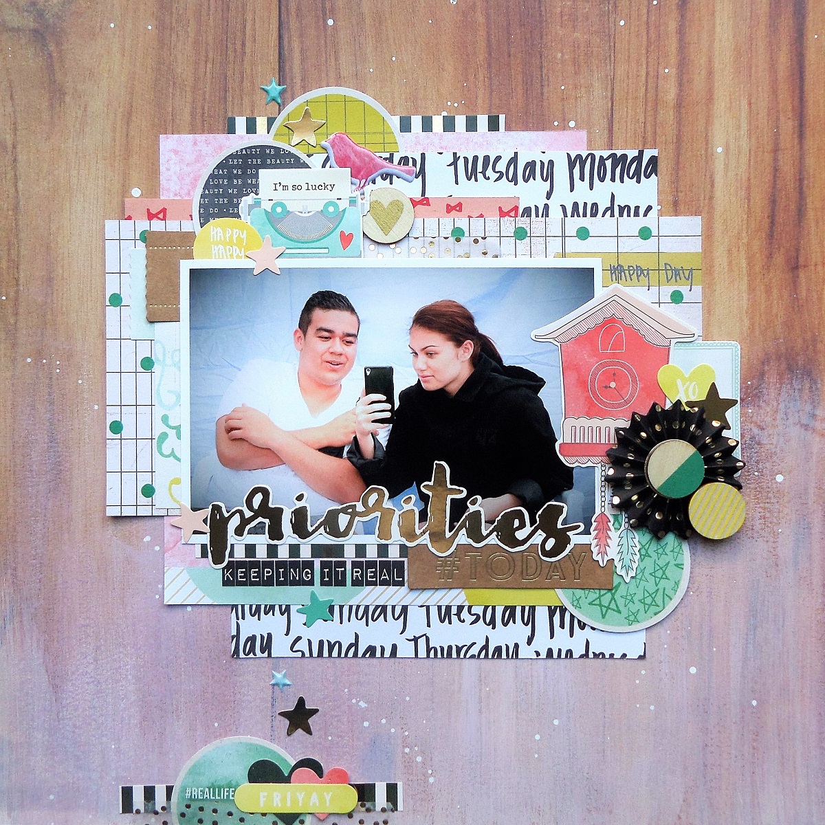
I used the colours from the piece as inspiration to create a layout featuring my boys with their dad on Father's day. 


  I used a mix of watercolour paint, texture paste and paper layers to give my page some depth and topped it off with a few fun embellies.  


You can check out all the fun layouts from the ARTastic team, and join in on the challenge over on their blog. Thanks for stopping by xx


a crate paper mix with some tips...


0 comments
I normally create project life pages for the Sassy Scrappers blog, but I decided to use the remainder of my Cook Kid 6x6 paper pad to put together a layout that combined a mix of products from several Crate Paper collections. 


I like to collect bits and pieces from several ranges as they are released and recently noticed a pattern!  The majority of my paper stash no matter which manufacturer they came from could easily be paired up to create cohesive layouts. I have a feeling that your paper stash might be the same and so I put together a few tips on the process I use when putting together a layout with a range of different collections. Check out the Sassy blog for extra pics and all the tips.   
Thanks for stopping by xx

sbm layout share...


0 comments
I am still playing catch up with my blog posts and am sharing one of my favourite published pages featured in the Master's challenge in Vol 19 No.1 of Scrapbooking Memories magazine. 


We received an awesome pack of goodies from American Crafts full of Dear Lizzy's 'Documentary' collection and I loved how every little bit seemed to fall into place. 


You may have already noticed that I have a bit of a thing for gold foiled accents  so I was in my element when I built up lots of lovely layers using a variety of textured stickers and ephemera pieces from the collection.


I used a dry brush to apply some acrylic paint onto the bottom half of the page and really like the way it softened up the wood grain pattern.


 Thanks for stopping by xx


september @kraft+...


0 comments
I'm still not sure how August managed to sneak by so fast, but a new month means a brand challenge from Kraft+ and the September melon toned mood board is simply gorgeous!!! 


I love the way these colours work with a kraft background and used the colours as well as the round melon balls as inspiration for my layout.  


I started with a cute Kaisercraft background and layered up various soft melon toned papers and embellishments around my photo.


As mentioned, I was inspired by the melon balls from the mood board to add a variety of round elements to the page and I also liked the use of the white frames separating each picture in the mood board, and incorporated white accents throughout the page to help the soft colours to stand out. 


Check out all of the amazing inspiration from the Kraft+ team and guest designers over on the blog, and be sure to upload your creations by the end of the month for a chance to win one of this month's prizes. Thanks for stopping by xx


newer post older post